

Plant Intelligence…and Beer!
It is a (not so) well kept secret that we have a homemade beer machine at Sure Controls. The beer machine is always the highlight of any facility tour we give to our customers. I thought it could also be a very cool way to demonstrate some of our Plant Intelligence capabilities! A few weeks ago, our resident brew master Josh brewed up a couple batches. While he brewed the beer we connected our in-house Historian that we use for internal testing of customer projects and used it to collect data. What I hope to demonstrate through this article, is how we we’re able to connect to the process to communicate the data, and then once the data is collected, what methods we can use to view the data.
Part 1 – Collecting the data
In my earlier blog “Demystifying Data Collection” I discussed in some detail on standards and protocols. I won’t get into that much detail here, but this exercise is a good example of how we approach projects we execute for our customers. First I sat down with Josh our brew master to determine which are the critical points of information we needed to collect. Basically there are three steps to the brewing process, the Mash, Boil and Break. The critical item to monitor during these steps is temperature. We also needed a way to tell our data collection system which step of the process we were in.
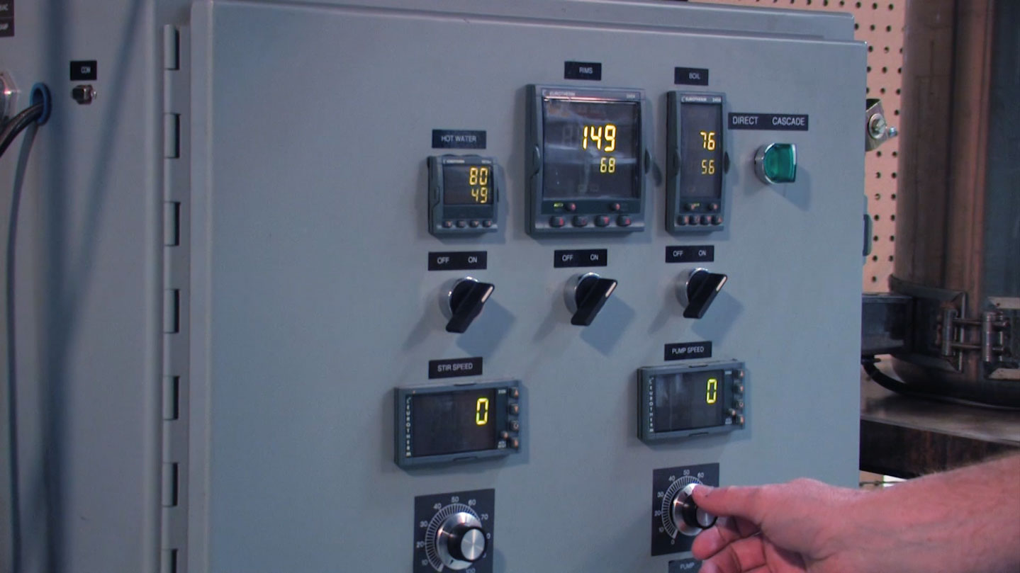
For collecting temperature data, we analyzed the beer machine and noted that there were temperature controllers wired to control the heaters for the cooking vessels used in the process. Luckily, these controllers have communications capability, so it only remained to determine the standard and protocols needed. These particular controls use Modbus as their communications protocol. This is great as Modbus is very common and easy to talk to. One challenge we did have was, the controllers themselves only used a serial link for communications, and our Historian server was some distance way. To solve this we used a serial to TCP/IP gateway device. This allowed our Historian server to use Modbus TCP to communicate directly with the controls and collect the temperature data we need. Next, to solve the process step question.
In order to capture which step of the process we were in, we decided to use a small PLC and HMI. We fortunately had a small PLC around that we use for application testing, and an HMI that we use for sales demos. We programed the PLC with a register that held text data. We then programmed the HMI with some simple buttons for our brew master Josh to select which step of the brewing process he was in. By pressing the “Mash” button for example, the HMI would then write the value “Mash” into the register programmed in the PLC. The PLC was connected to the Ethernet network, and Historian could then read the register directly logging the process step. This will aid later when viewing the data, in order to give it context.
Part 2 – We have data – now what?
Once the batch of beer was brewed, we used the process steps logged by the PLC as our flags for pulling the data. By noting when the process steps change, we could capture the start and end points for each step of the process. We then brought up each step of the process in a trend view:
The Mash
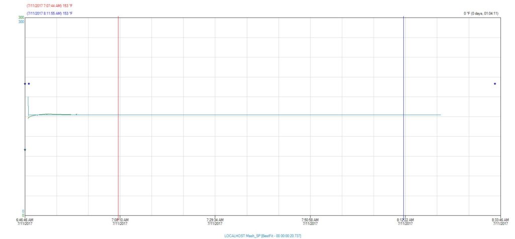
Here we can see that during the Mash phase of the brewing process, our temperature maintained a steady 153° Fahrenheit.
The Boil
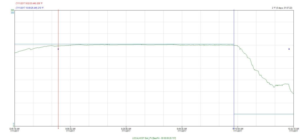
The same thing holds true for the boil phase, our temperature holds at a steady 210° Fahrenheit.
The Break
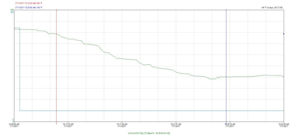
This step is considered critical to the brewing phase, as it is important to bring the Wort (this is what the liquid is called during the brewing process – it’s not beer yet) down to a temperature where it is safe to pitch the yeast. We can see here by our trend that it took approximately 13 minutes to bring the Wort from 200° down to 100° Fahrenheit. All in all, it appears our brew master did an excellent job with this particular batch of beer.
Let’s talk a bit more about the data. We used trends for our initial analysis. Presenting the data visually in this way allow us to quickly spot any anomalies that might have cropped up during the process. If, for example, during the boil phase, if we saw a sudden drop in temperature for a small period of time, then we would start to ask what happened? Did a fuse pop, causing an actual loss in temperature, thus putting the batch in peril? Or did a sensor become detached and thus the data is skewed, but once reattached we could see the temperature was holding constant, so the batch is likely okay? This kind of analysis can become very useful in identifying “what went wrong” if something didn’t pass quality tests for example.
So, what if we just want a simple summary of what happened during the batch? Using the Query tool from our Historian client, I can do a simple summary like this:
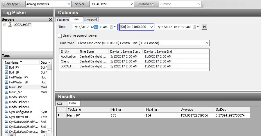
This is a very simple statistical analysis of the temperature of our Wort during the Mash phase. I pulled Min, Max, Average and Standard Deviation. This gives us a great one line view of what happened. I can see that the temperature stayed within one degree of setpoint, and averaged almost exactly at setpoint for the duration of the time.
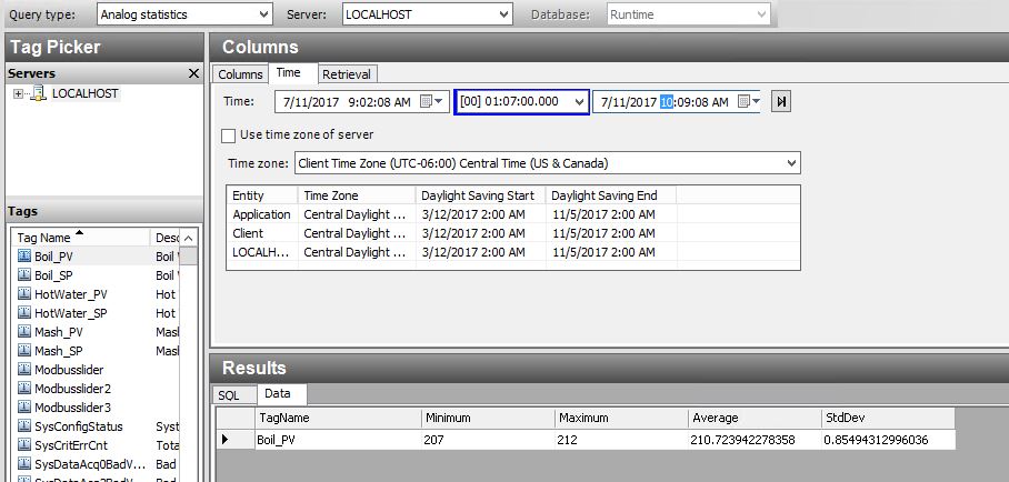
I can see that there is a slightly larger variation during our Boil process, but still well within acceptable parameters.
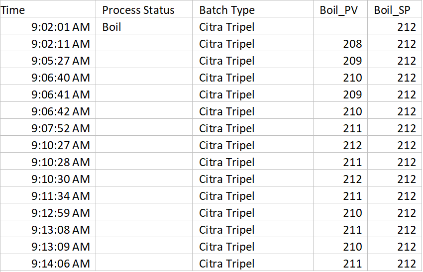
Finally, if I really want to do a “deep dive” into the data, I can easily export to Excel which is a familiar tool and I can view the raw data directly, create my own charts and reports for doing additional analysis:
Some additional “Tips and Tricks” for data collection. If we were a real brewery, it would be a very good idea to assign a batch number to this batch, and log that value to Historian as well. Then, the next time I brewed the type of beer “Citra Tripel”, I could go back and compare my latest batch to the previous batch. If my beer taster(s) note anything extraordinary about a particular batch, we can then analyze what happened, and then update our recipe in order to replicate that improvement in future batches, or just compare how we did. Also, using the trend tool, we can pull up data from both batches simultaneously using the “time offset” feature, allowing a nice detailed visual comparison by overlaying both batches within the same trend.
I hope you enjoyed this article. This really just scratches the surface for what automated data collection can do for process improvement. In a future article, I will discuss additional techniques for capturing downtime data and analyzing causes. In addition, I will talk about how we can leverage the data collection system to notify our process team when an event is occurring, instead of analyzing what happened “after the fact”.

